Hello friends! I’ve been busy with other EAD projects, so E has been taking care of blogging for the past couple of days. But I’m back with our next board!

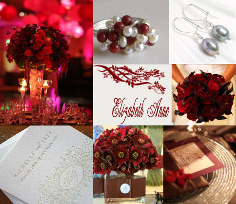
Image Credits (clockwise from top left): White Lilac, MiCarterita, cymbaline84, The Knot, White Lilac, The Knot, Black Pearl Press.
I learned that cranberry is a very strong color. It has a tendency to overpower whatever color it is paired with (top left pictures is great example of this). Gray is such a soft neutral color, that you have to be careful about the amount of cranberry you use with it (the pearl ring is the perfect ratio in my mind).
Bringing in my post on DIY Graphics, the center image is a great example of a brush found on Google, and the Champagne font.


