Up next, choosing an image that captures the event and works well with the colors.
While brushes and vector images are a great start, I usually have the best luck with rubber stamp. So, I started my search at Paper Source because I remembered a few images that might work. I found three images that I really liked.
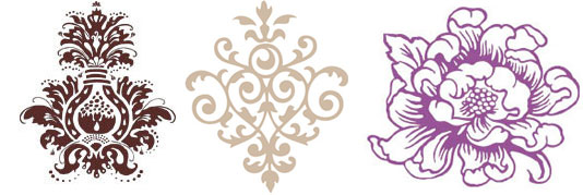
Even though I loved them, they weren’t quite what I was looking for. I realized that I might just have the perfect stamp in my stash at home. It was both floral and modern.
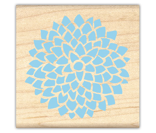
I really like how this looks stamped. To make the image more versatile, I needed to make it digital. So I stamped the image in black ink, scanned it in, and opened in Illustrator. I then chose the Live Trace Option and this is the final image.

As you can see, it definitely has this handmade imperfect feel to it, which I love. I then colored in the image by entering in the CMYK values from the colors I chose yesterday. The end result? Three flowers in the exact shades I wanted. Now I get to pick how I’ll use them!