
Hey friends, just a quick post from me. It was a wild weekend with three of my bridesmaids coming into town along with my mom and mother-in-law to-be for my bridal shower/bachelorette. It was a wonderful, awesome time, but needless to say I’m a little, em, tired. With lots to catch up on.
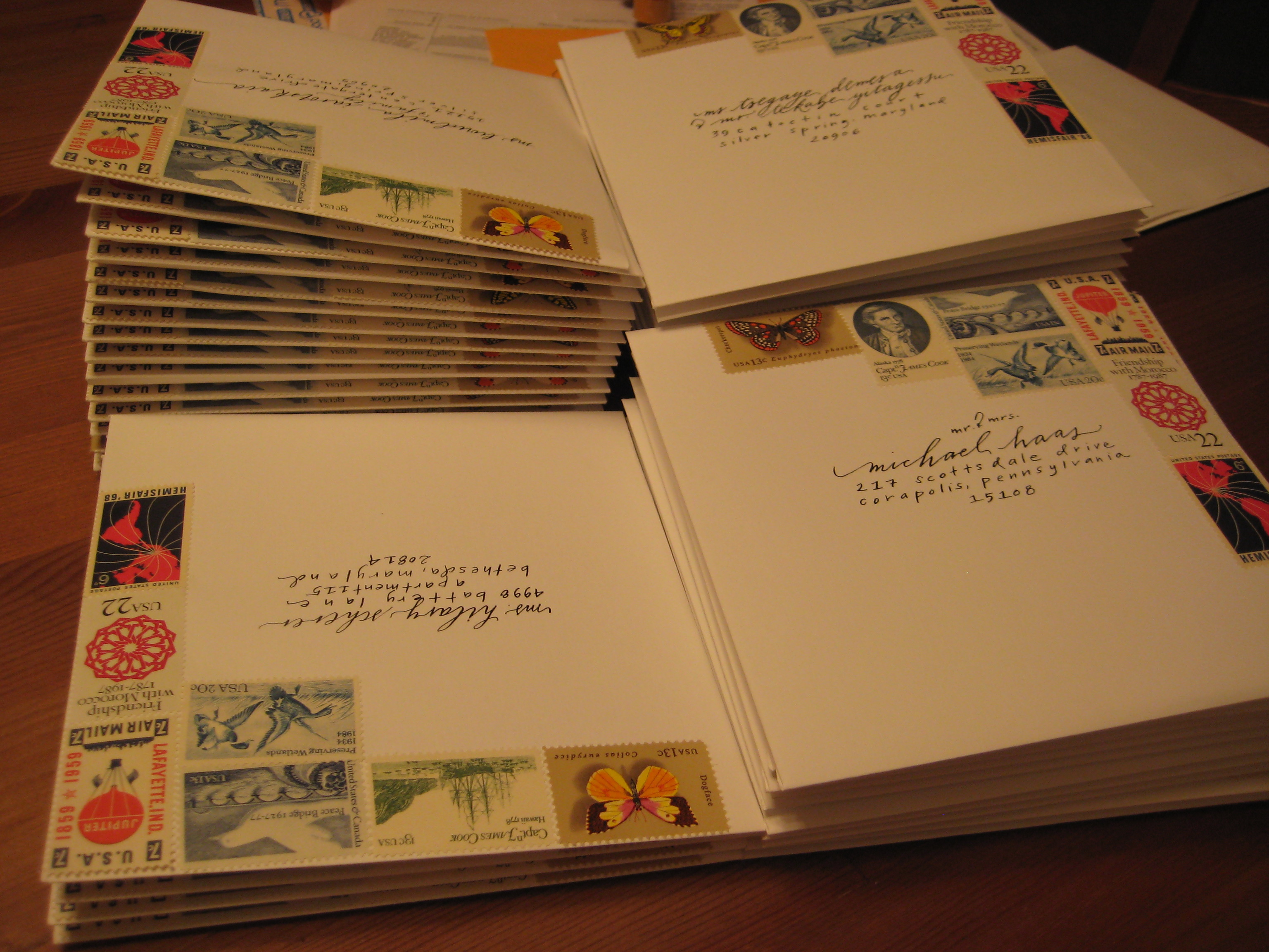
BUT! Now that our invitations are officially OUT and we’re starting to get our replies back, I wanted to share them with you all. This is going to be a little mini two-part series, starting out with our envelopes!
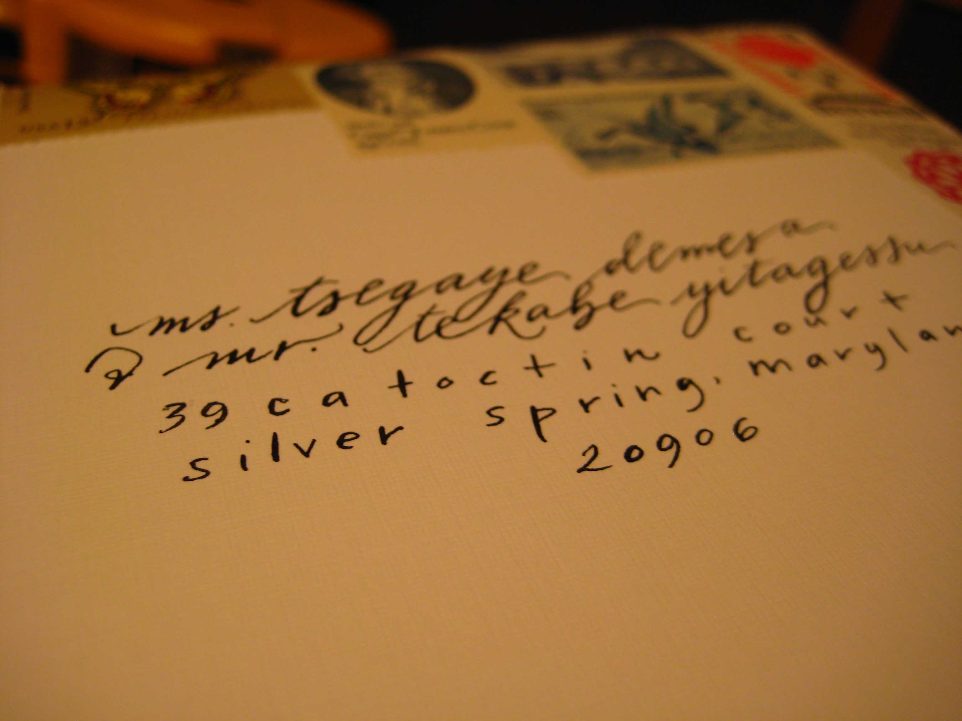
I always knew that I wanted to have calligraphy. I understand why it is often the first thing cut from the budget but to me, it was important. I love calligraphy. I had a calligraphy set growing up and even though I never developed any great talent for it, I always appreciated it.
Just like every other decision for my wedding though, I didn’t want your typical, ornate, cursive-like calligraphy. I was inspired by more quirky, different calligraphy styles like those of Betsy Dunlap and many others. But of course I didn’t have the biggest budget in the world.
Enter the wonderful Mara Zepeda of Neither Snow. Not only is her work beautiful, but it is affordable ($2 per envelope!) and she was a joy to work with. I would highly recommend her to all of you!
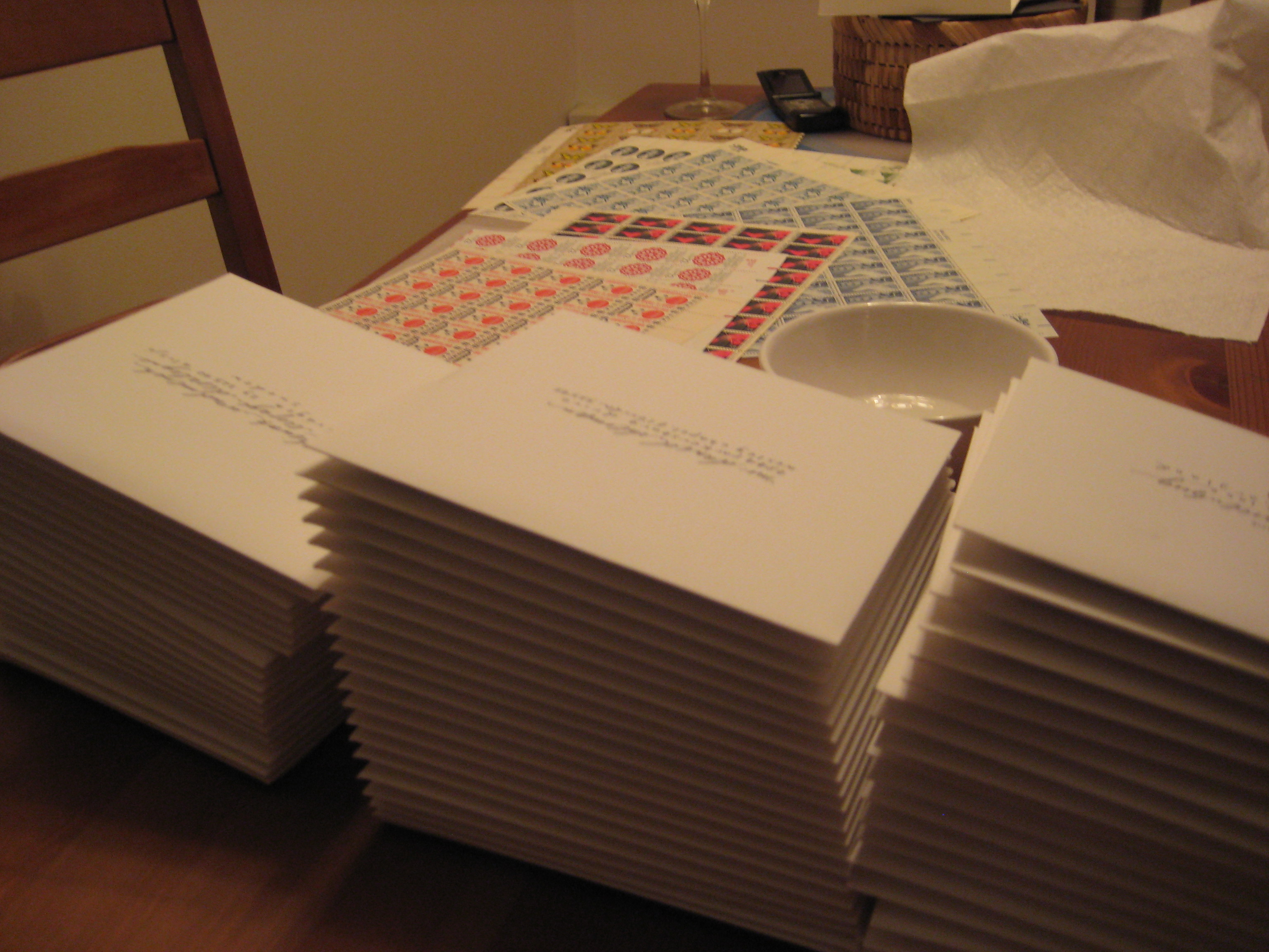
Now let’s talk about the stamps! From reading wedding blogs, I heard about the concept of vintage stamps. When I told my friends and family that I wanted to do them, I got mixed reactions. Some people thought it was crazy or strange, others thought it was super cool. But it was definitely something I wanted to do, so I dove right in.
The challenge with vintage stamps is two-fold. First, you have to hunt down the stamps. I found the majority of my stamps on eBay, but I also bought a couple sheets from a local antiques trader here in Boston. The other tough part is pulling together enough value without having to put too many stamps on each envelope (though I learned that you can also put them on the back if need be!). Most of the really cool looking stamps have very low values (under 10 cents). So you have to get a mix of the older stamps that you really love, and newer stamps that bring the higher values that you need but work with the overall look and feel of the group of stamps you’ve chosen.
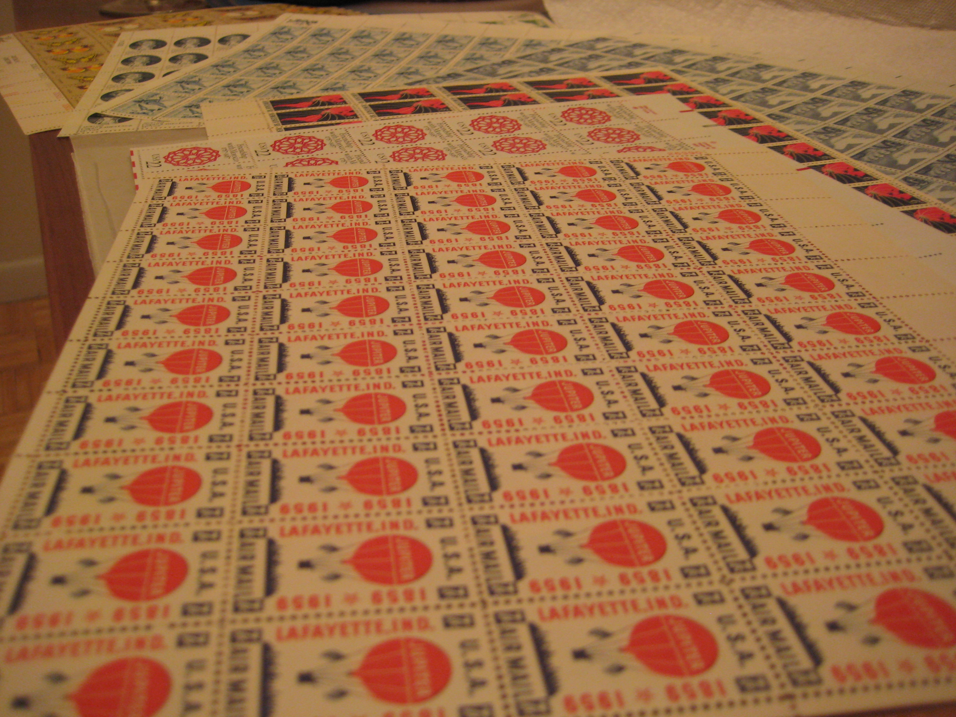
One tip I would offer – pick stamps you love but try to keep the overall picture of how they’ll look all together in mind. There are some very cool-looking graphic stamps from the 1970s that I loved but they didn’t quite fit into the muted, vintage tones I was aiming for.

What do you think? Are you doing vintage stamps?