Wedding Colors
Welcome to the EAD Weddings blog! We are so excited to have you here. If you are a new visitor, we'd love for you to subscribe to our RSS feed and visit our sister site, EAD Living. Thanks for visiting and we hope you come back soon!
Choosing the wedding colors was initially really tough for me. I knew I wanted a main color that would work well in the fall (i.e. not seem out of season, like a light pink or turquoise might) and then one or two complimentary colors, but it was really hard nailing down a palette that felt right.
First I thought maybe navy and a green color (all images courtesy of snippet & ink, unless otherwise noted):


But something about the green made it feel summery, which I didn’t want.
What about white? Very bridal (obviously) and sort of a-seasonal (if that is even a word, probably not).

So wintry, though… and I feel strongly that the word snow is a “bad four-letter word” - so white is a no.
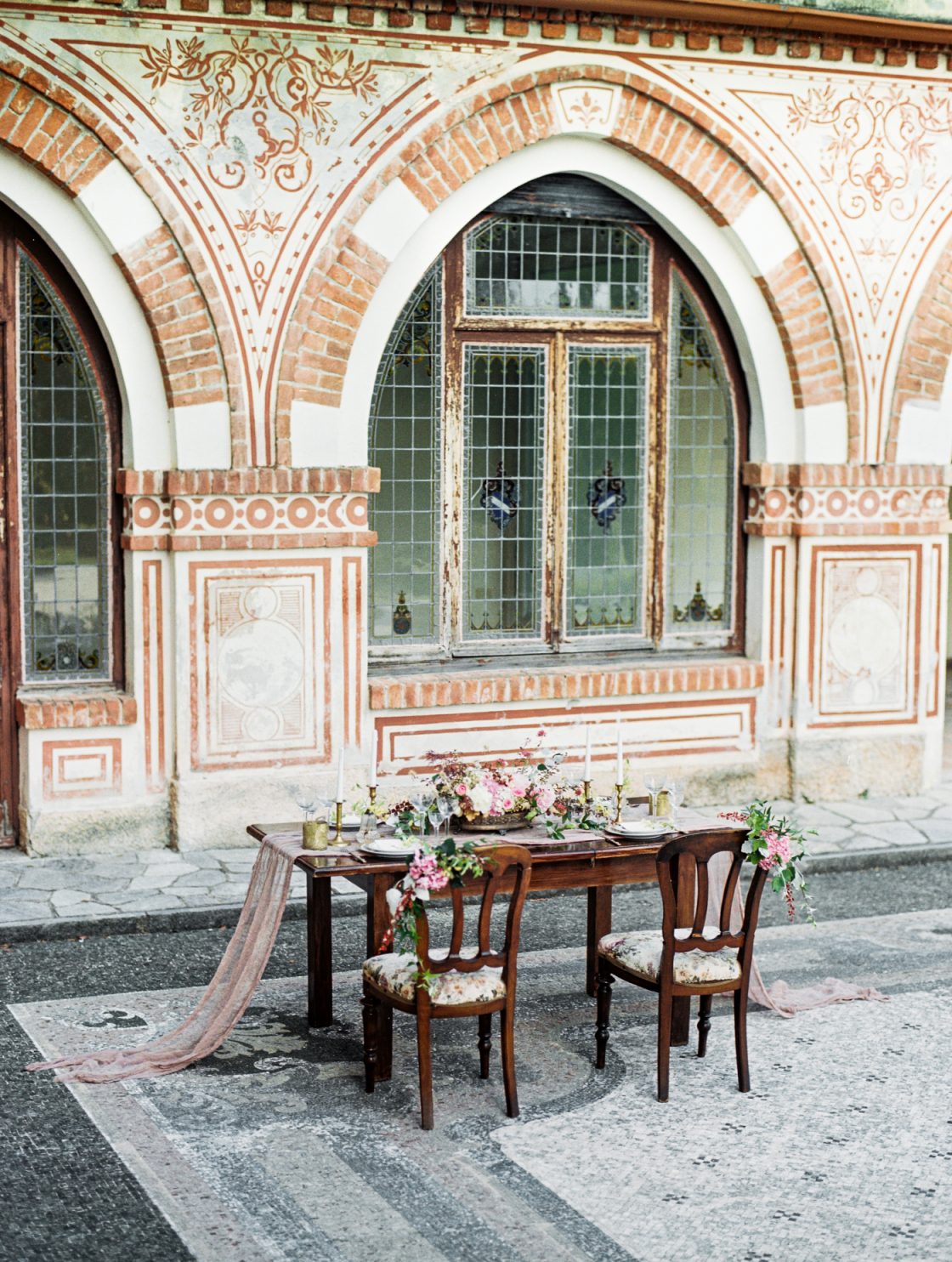
Then I thought maybe brown could be the primary color - very fall:


I stuck with brown for a while until I realized I really didn’t the color all that much - the idea of having brown bridesmaid dresses just made me feel blah - nothing about brown makes me light up or feel excited, it’s just… brown… and I wanted my wedding color to make me smile.
I kept going back to navy… it would work in the fall, though it’s not a typical “fall” color and I get a good feeling when I think of navy (which sounds ridiculous, but you have to take those things into account!). The dilemma? Since it’s not a standard fall color, how could I make it work without being too summery or too nautical? The accent color would be key, but I couldn’t come up with one I liked… When I talked to my all too rational mom about this she said “you just seem to want navy. Why not just have navy be your color and pick the accent color later?” Genius. We went ahead with navy and haven’t looked back. Here is the inspiration board I made the night I decided navy was the color:

However, I still haven’t found *the* accent color… I did add a taupe color to the navy (it’s actually the color of the sash in my wedding dress - more on that later), but I still think we need a pop of color in places - the bridesmaids shoes, for example - and I can’t find a color that feels right. Here are some options:
Navy and yellow or navy and orange (definitely fall colors, though the yellow still feels a little summery, especially with the navy, don’t you think?):


I like the orange/marigold color, but Brian told me he’s not a fan… Look how pretty those bridesmaids look with those orange bouquets?! I might try to convince him…
There are also some more feminine options using “girlie” colors like pink or purple:


I like the lavender color above better than the pale pink, but both, again, seem like they would work better for a spring of summer wedding or even a fall wedding in a city - not a fall wedding in the mountains. I’m keeping the lavender in mind, though.
A recent find is navy and a deep red (my mom is thinking of deep red or burgundy for her MOB dress, so it’s been on my mind lately). I really like the below inspiration board:
And, last, but not least is trusty navy and green, though I like this board better than the ones above - it uses a darker, more olive green as opposed to a summery, grass green (this one is from With This Ring):
Any thoughts? Help!


![]()
Personally I love the pink with navy. Give it a pop - probably because it’s a soft light colour against a rather dark and ombre navy? The red would be my second pick although it seems pretty dreary together with navy - again I’m thinking both dark colours. But I do agree that red is very fall-ish. It gives this rusty touch to the colour palette and that I love.
I love the deep red with navy. Maybe the deep red coupled with bits of orange? Like the fall leaves. In any case, I love Navy in the fall.
I love the orange. I’m doing a summer wedding wtih orange and navy and lavender and have had a similar problem feeling that my colors are more fall than summer. I think orange is such a versatile and unexpected color and beautiful against the green of the mountains, yet heavily grounded by the navy.
LOVING navy and orange but it’s done quite often so navy and lavender seem to make a good match. You can do a lot with lavender.
I think the navy and lavender look nice together. You could do navy and use jewel tones as accents - raspberry pink, cranberry red (burgundy), a rich teal green and plum purple. They are all rich and fall colors and since they all compliment each other, you can mix and match a bit. I bet a wild freshly picked looking bouquet in raspberry, plum and cranberry would look lovely and very fall!
I know how you feel. My wedding is in mid-september and in CA- that is late summer but not summer, but not fall either. It’s a hard color palette to get right! I like the navy with the deep red, with accepts of amber. The light is always amber colored in the fall. The board you say you like feels the most like fall to me of any of them. Green, as you say, just doesn’t feel like a fall color since that is the time really when all the green changes to other colors. Maybe use a fall leaf as your accent against the navy, that would give you a color range of persimmon, amber, and rich red. The navy dresses would keep it from getting too seasonal!
Hey, I immediately though grey would be a lovely elegant complement to the navy. I personally LOVE grey and taupe together (http://www.elizabethannedesigns.com/blog/2009/06/08/glamorous-gray/)
and think navy would go great with that. It’s kind of wintery, but not in a winter wonderland kind of way. It’s warm, rich, and elegant.
Otherwise i’m really a huge fan of the navy/olive/slate board. I think it’s also beautiful for fall.
Oh, and I think yellow definitely reads summer, the brighter/ligher pinks draw away from the navy and take over a bit too much, but the darker rustier red is nice and fall. Orange is nice too.
Here is a board someone made that is orange, navy and redish… very fall.
Wow! What a great response - it’s sooo good to get some other view points (besides the ones in my head!). Here are my thoughts on your comments:
@Jamie - i definitely see what you’re saying about possibly getting too dreary with so many dark colors - I should mention that (right now) I’m planning to have mostly white flowers with pops of navy… hopefully that will lighten things up a bit
@Megan, @Kelli, @Kate - I love the navy and red/orange, too, but do you think it’s too obvious? I’m not sure where to bring it in so that it’s not so forced (i.e. screaming “hello, it’s Fall!!”)… does that make any sense?
@Kate M. - I love the idea of using jewel tones (think of the possibilities!), but I’m pretty sure Brian will think it’s a bit too girlie… I mean, he’s on the fence about red…
@Kimmy - we are doing navy and mushroom for sure, which I love. those are going to be the main colors (especially since they are the only ones we can agree on!) and we’re (well, I am) thinking of adding pops of color elsewhere, which is really where I’m struggling most! Where do you add in these pops??
More food for thought out there: As I said, I’m planning to do white flowers for everyone (all white for me, white with privet - navy - berries for the girls), but perhaps I could add some pops of red or orange (or both?) to the girls’ bouquets? Hmm… any other places for good color pops?
I think the deep red combination is the best. It looks like fall colours and looks nice and, if your mother is wearing that colour is perfect!!!
superkitina’s most recent blog post: Midnight projects
We’re having a navy & yellow wedding this October in the foothills of Virginia. I’ve also brought in reds b/c….well, who said you can only have 2 colors in your wedding??
Elizabeth’s most recent blog post: Where my girls at?!
I’m partial to the last pallette and modified it to fit my wedding.
(last collection orginally from here: http://www.swsmag.net/blog/2009/5/12/gia-graham-color-palette-majolica-blue-warm-olive-and-slate.html)
What if you used colors like harvest yellow or harvest orange? Think like trees changing, pumpkins, indian corn…those types of colors. I like the idea of navy with mushroom and then adding those harvesty pops of colors in the bouquets, centerpieces, table decor, table runners/tablecloths, napkin rings, votives/candles or candle holders, favor packaging, bridesmaid jewelry. I feel like you could use these colors but keeping them still in a lighter shade so it doesn’t get too dreary. Haha, I’m sure if you check out the JCrew catalogue they’ll have some good fall colors :)
juel’s most recent blog post: Wedding Dreams
Thought of you tonight while driving home. The moon was this beautiful creamy-amber color against a midnight navy blue. Definitely very fall like!
![]()


