
So here’s a picture of what my morning is looking like so far:
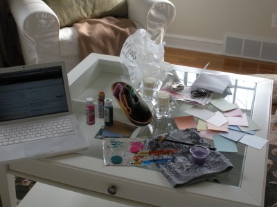
{ photo by me }
Along with finishing off the puppy collars that I knitted for FMIL’s dogs (you can kinda see the buttons I’m painting in the photo) and several other chores around the house, I’m also going through a bunch of cardstock color swatches for our invitations.
Going with of our lack-of-“wedding colors” idea, I had this idea of a multi-colored invite but now that I see all of the colors together I definitely feel like it’s going to be too much. So, now I’m trying to figure out how to use more than 2 colors without making it seem like an invitation to a circus!
Some things I KNOW I want to include with our invites:
- vintage stamps
- pocketfold
- a cool font
- some nod to something Spanish – either a Spanish tile pattern as an envelope liner, iron scroll work as detail on the invite, or the orange tree my mom drew for our save the dates.
- natural-colored envelopes addressed with white calligraphy
- color
I like the trifold pocket enclosure invite idea, so the invitation would be matted in the center with a pocket on the right side that has the different cards (directions, reception, rsvp, etc). Originally I had thought it’d be fun to have each one of the cards a different color but as I said, now that I see all of them together it’ll be WAY too much.
Here’s some inspiration and ideas that I like so far:
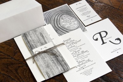
I like the simplicity of just the tree at the top on these.
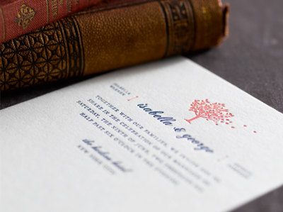
{ invitation by Mika 78, image via Style Me Pretty }
Sigh, to have letterpressed invites. Perhaps we can use the tree from our save the dates? I think this idea might be a little TOO simple though.
Love the watercolors at the bottom here.
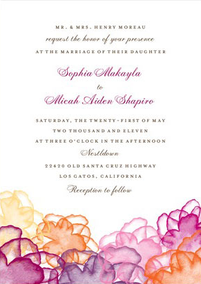
{ image via Wedding Paper Divas }
It uses a lot of color, but it’s not too rainbowy I think?
How cool is this font!
{ image via Rifle }
I like how these feature that iron scroll-type work. Reminds me of all the wrought iron gates with bougainvillea growing up them in Spain.
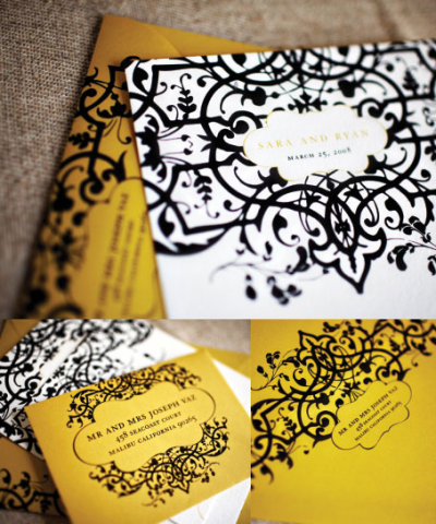
{ image via Wiley Valentine }
Love love LOVE these invites. Everything about them. The vintage stamps (I’m totally jumping on that bandwagon, think they’re so cool!), the font, the colors of the suite, the vintage maps, the dark envelopes and white ink.
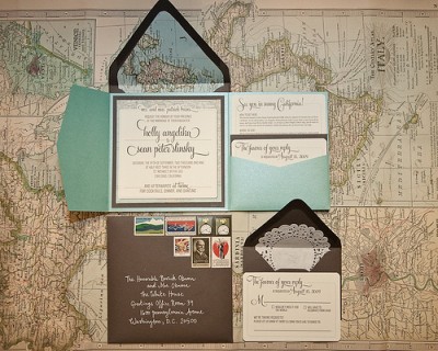
{ image via Nothing But Bonfires }
Ok so in that last one, they stuck with two colors, but the envelope liners, stickers, and matting of the invite gave it a bit more color. Maybe that’s the best thing to do? Out of all of these ideas, which do you think would work the best with our Rustic Mediterranean feel? Would it be too much to use all of them?