Help Mo Pick Lanterns!

img_3331
[The inside of the tent with yellow and white lanterns, lanterns are 24 inches]

We have decided to have about 30-50 paper lanterns in the tent to fill the space and add lighting. This was a slightly tough decision, because our venue won’t let us put the lanterns up ourselves. Someone who is licensed and insured needs to do the dirty work for $350. Ouch.  So although paper lanterns sound like a cheap option for decorating, they are in fact not going to be cheap for us at all. I feel as though we had few choices, because we can’t hang any lighting up there ourselves, so it was either pay the fee, or go without any pretty lighting in the tent.

Since we have now committed ourselves to this extra invoice fee, I need your help. These are the colors I am thinking about for the tent:

lanterns

[Paper lanterns from Luna Bazaar]

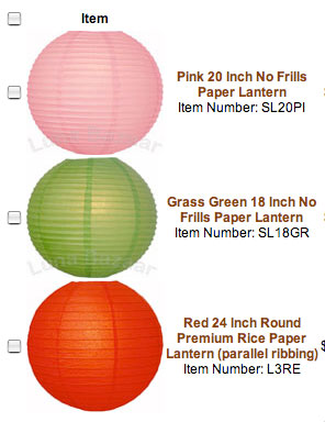
Those are the colors that match our color scheme, but I was thinking maybe even more colors would be fun, like in this amazing inspiration board (look in row 3). (Keep in mind, this is our inspiration, and this is our website.)

Here’s where you can help! Which option do you like?

A. To h%^& with a color scheme! Go with more color, it will look perdy.
B. Keep to the three colors, it will make the decor look more unified.
C. There are too many colors, I would only do one of those colors or two.

we heart your comments!
  1. i like option B. but if you wanted to add more color, peach and nude would be nice. maybe even a deeper pink and a foresty green.
    .-= honeymyheart’s most recent blog post: Sounds of the City: El Rey Theater =-.

  2. I like the idea of keeping it colorful, but you’re right, it could get too busy… maybe you could keep to your color scheme but add in a neutral for more variety, like a white or off-white? What you’ve got is pretty bold already, I think, and a neutral would soften the look and keep it tied in with everything else.
    .-= kathleen’s most recent blog post: I feel pretty… =-.

  3. I think you’re asking because you want to add the color. And, personally, I like more color (especially in the lanterns, it will just be a nice additional accent without getting overwhelming.) I’dd add in a few purples and yellows like from your save-the-date. That would absolutely work with your color palette and yet add more pop and pizazz. Remember to think about color proportions too – you don’t need a bazillion yellows- just some pop – whereas purple is more muted and less demanding visually. But you know what? No one besides you will care anyhow. They’ll just see fun pretty party lanterns after the in-tears ceremony and they’ll see everything as beautiful.

  4. I have to admit that I think less is more at weddings – especially when it comes to colors. I suggest that you go with only 2 of those colors and bring the 3rd color in more with your linen and flower choices. You still want it to look elegant/beautiful and fun for your wedding – you don’t want it looking like a children’s birthday party :)

  5. I think you should go with the colors you have and then add a pattern like this one.

    http://www.paperlanternstore.com/dapala.html

    We used these at my friend’s wedding mixed with solids, and it was really fun!
    .-= Abbie’s most recent blog post: If I Had a Million Dollars… =-.

  6. Mo writes... {November 24, 2009 at 1:18 am}

    Thank you everyone for your suggestions!

    @Becca: So true, I doubt anyone will notice. I’m guessing they will momentarily go “oooo” and then sit down anxiously expecting dinner, but y’know, gotta go through all the possibilities of what they will see when they say “oooooooo”. :)

    @Born To Be Mrs. Beever: Well, this is a girl who still uses Hello Kitty stationery and drinks her daily tea in a pink coffee mug with hearts and an owl on it, so I don’t think anyone at my wedding will be surprised if it looks like a kids’ birthday party. They’d probably be more shocked if it didn’t, haha.

    @Abbie: Great idea! More options to ponder, excellent.
    .-= Mo’s most recent blog post: Help with Lanterns! =-.

  7. I say go for the colors! As long as you love it, that’s all that matters ;)
    .-= Melissa’s most recent blog post: Our French Laundry Adventure- The ULTIMATE Dining Experience =-.

  8. I would stick to three colors and use two of them more frequently. Since all the lanters also differ in size I think it would be too busy otherwise. Two colors, like in the picture, feels like it is not yet done. But I agree with Melissa, go with what you like! It is your wedding! : )

    http//:cestsuperbe.etsy.com

  9. I would actually stick to two colors – it definately feels busy to me adding more. But then again, I have a pretty classic, monochromatic sense of style ! :-)

    Thats insane about the extra $350! Those little hidden fees will get cha.

    But I LOVE the lanterns in the tent idea! Soo chic.

  10. Jamie writes... {November 24, 2009 at 6:41 am}

    I agree with Abbie! The 3 colours you picked out go really well together and some patterned lanterns here and there, sticking to those 3 colours, would add some variety instead of all solids.

  11. I definitely say all three…

    Given that the pink and green are the same intensity of color I would stick with those as the mian backdrop and accent with the red. You could do either little pops of red throughout or concentrate in one area of the tent to highlight an element like the cake, head table or dance floor.

    -OR-

    I would do all one color- probably the red because it would give a nice glow to the room.

    Something about only two colors feel matchy matchy to me, the third color gives it an elevated look.

  12. I love the 3 you have picked out, with your inspiration board, and Kathleen’s idea to put a neutral in too (although if it was white, they would disappear against the white tent)

  13. I personally love the idea of incorporating more colors. (Maybe not a ton more, but a few.) Someone suggested purple — I love that idea. I don’t think you’d go wrong with sticking to the color palette, but I love bright colors. But then my kitchen resembles a carnival scene color-wise.

  14. I think all three, although I’d pick one as an “accent” and use it much less frequently than the other two.

    Sucks about the $350, but I’m actually pretty nervous about climbing up a 20 foot ladder to hand the lanterns at our venue. OK, it probably won’t actually be me on the ladder, but you know what I mean.

  15. I like option B. So pretty.
    .-= The Professional Bridesmaid’s most recent blog post: Happy Thanksgiving! =-.

  16. I think a mixture of all three, but I’m a sucker for the red (it’s one of my wedding colors).
    .-= Brit’s most recent blog post: black & white =-.

  17. I like the idea of having loads of colours and don’t like the idea of just one or two colours (too boring) so I’ll probably sit on the fence and go with option B. Although, if the rest of the decoration are quite neutral, I’ll go with option A to just to put a lil more colour to the place.

Leave a Comment