
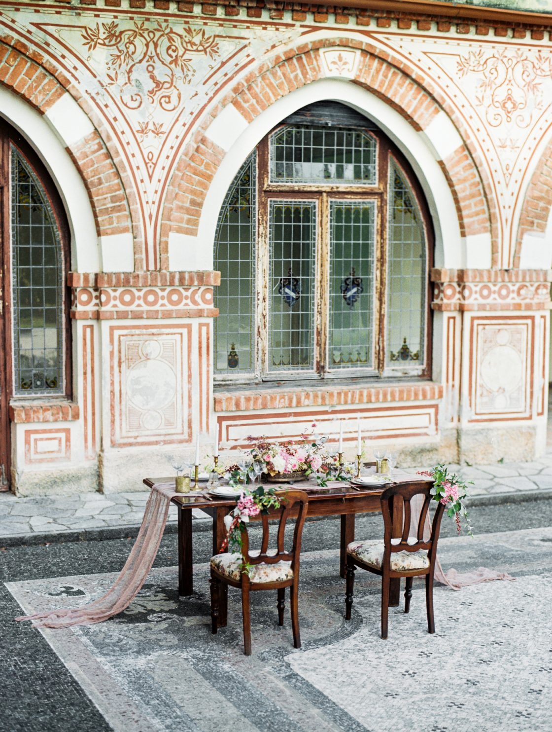
Well hello readers! It’s been a heart-stopping summer and now that things have calmed down for a season over at In The Now Weddings, I’m anxious to get back into the swing of things here at EAD! I must admit, I’ve missed you all. Your kind words, encouragement, inspired designs and enthusiasm for the industry… so YAY for being home!!
I thought I’d start out with a feature on one of my more recent tabletop shoots. This setting was totally inspired by the Rat Pack [too cool for school] style of Mid-Century design that makes my personal world ROCK! I paired a cool aqua with a hip kelly green and crisp white. The setting over at the brand new Shorebreak Hotel in Huntington Beach was the PERFECT backdrop for this table! If you live in Southern California and haven’t had a visit- do it! It’s definitely worth your time. Now, onto the funky freshness that is an In The Now Weddings tabletop design! All images courtesy of Wayne Toshikazu.
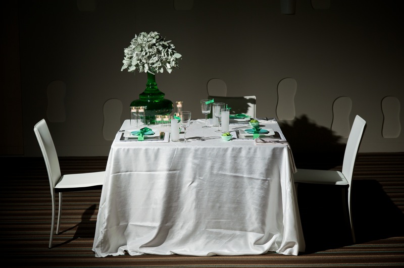
We paired a white bengaline linen from BBJ Linen with all white leather chairs and various place setting items from Classic Party Rentals. Bengaline is a newer texture and is literally to DIE for, ladies! It’s a slightly ribbed, subtle fabric with a sheen to it, different than satin and closer to taffeta in shine-factor, but a style all it’s own and PERFECT for the 2010 wedding season!
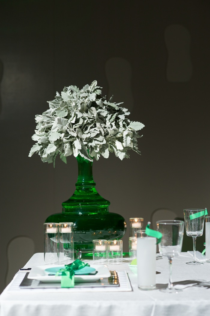
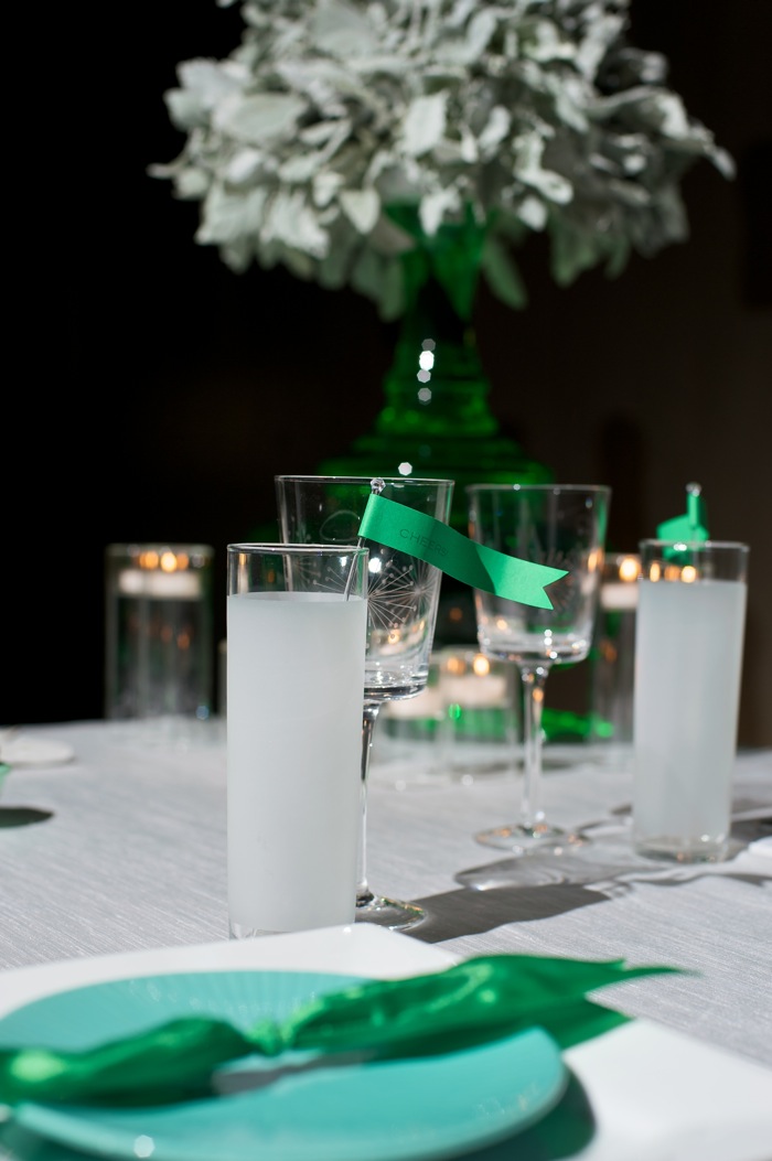
The “funky tree” as the In The Now team has coined it, was created by US using dusty miller. The vase is actually a two-section clear glass vase that I picked up on sale at Z Gallerie. Z Gallerie is the cryptonite to my Superman. Serious style! Candle holders [dying at how cute and mod they are] and colored plates were from Crate and Barrel.

Monochromatic drink flags (which may be my favorite thing to have made ever ever EVER) that read “cheers!” were easy to make and pushed the cuteness factor OTT [over the top]!! The frosted drinking glasses were the perfect compliment to the stemmed wine glasses, which held the mod style astroburst pattern – very 50’s Vegas style! The pattern was mimicked, but not copied, with the top plates, being ribbed themselves!

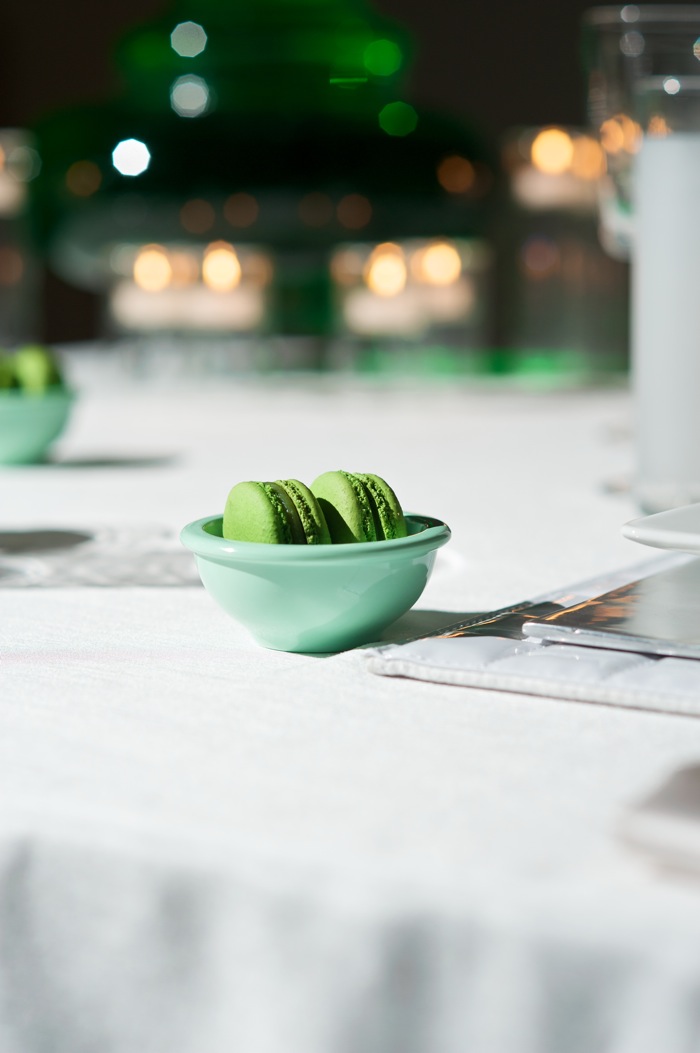
Dying at the kelly green maracons [from Paulette, where else] in the mini aqua Martha Stewart prep bowls! They make the perfect eat-and-go favors!
A simple way to tie in more color: ribbon wraps! We decided to wrap the ENTIRE place setting in a kelly ribbon, to give us that punch of extra color this table needed. It was easy to do and really made a statement!!
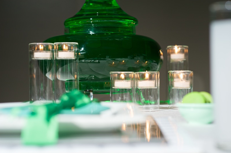
And yes, we tinted that green water, by hand/eye, to match the rest of our setting!!

I told you those hand-curled acrylic drink flag stir sticks were killer, didn’t I? I just want to hug them!!
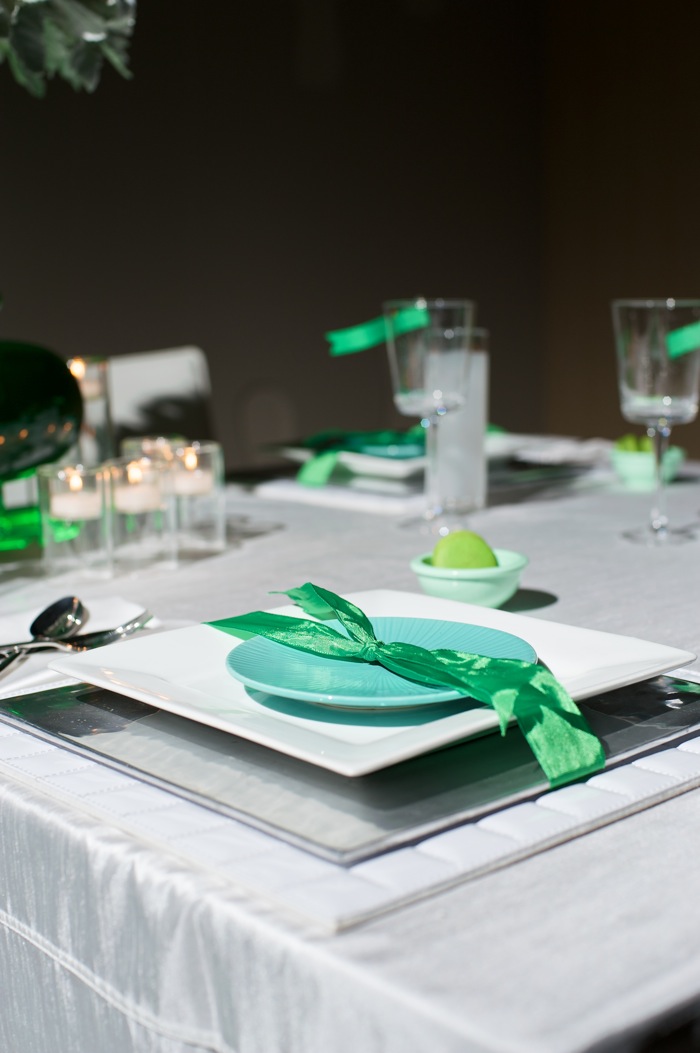
Place mat + charger + plate + bread plate + ribbon to package= goodness. Real goodness!
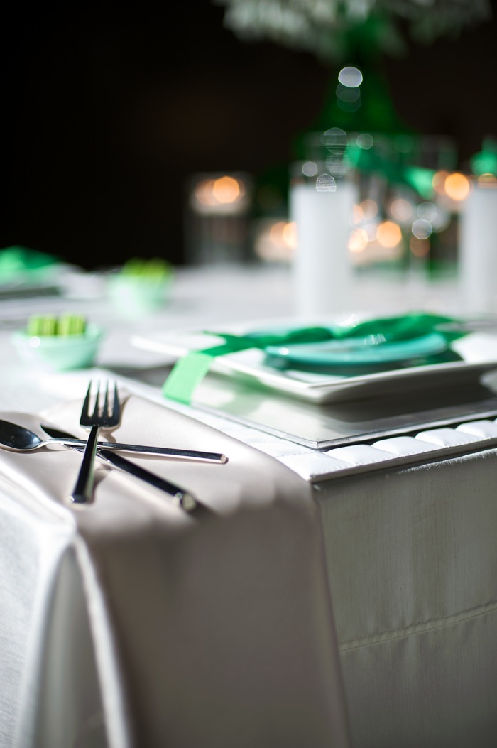
And here again, we mimicked that astroburst pattern to send the table OUT the door and into the NOW! The subtle differences, like in the way cutlery is placed, make the largest impact!!
What does this design say to you? Do you see the vision? More importantly, do you see it follow through??
xoxo,
A.
Ed Note – I’m so thankful and excited (as I’m sure you are too!) to welcome Amanda from In The Now back to EAD. In the Now specializes in southern California event design and can whip up their magic for all clients based on location and needs. You can find more of Amanda’s Elizabeth Anne Designs contributions here – she shares many more tabletop designs, as well as smart and insightful wedding planning advice!