
Designing my own invitations was undoubtedly the most daunting and time-consuming DIY activity thus far. Prior to assuming the responsibility myself, I perused hundreds of invitation templates, online and in-person, searching for the following criteria: simple, concise, personal, one-page (green), my colors (kraft-paper-brown and silver), travel-themed, rich, and affordable. During that time, I found a lot of what I was looking for–but not in the same invitation suite. So I saved all my inspiration; internally dug up the knowledge I learned at a 2-day Photoshop training two years ago; and spent four months analyzing, agonizing and eventually, designing my own invitations. That being said, seeing them printed and sent is so satisfying, I would do it again in a heartbeat.
I knew from the start I wanted the invitation to be on one page. I didn’t want guests to lose critical inserts and hence information, so I decided that a “Z” shaped invite would work best. I researched professional letterpress and thermography printersand asked for quotes for 15×7 double sided invitations (the 15×7 folds down to three 5x7cards). Thermography was less than half the cost of letterpress, but still looked incredibly classy and rich (since it is raised), so that decision was a no-brainer for us. We worked with Big Tuna Marketing who not only provided reasonable rates, but were INCREDIBLY helpful and patient over the FOUR months I worked with them! Furthermore, their quality is A+; I gasped with glee when I finally saw the invitations in print–Big Tuna Marketing made them look like a million dollars!
So without further ado, my labor of love…
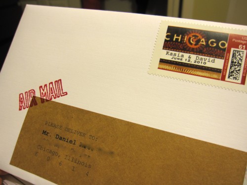
The front of the envelope
The white linen envelope matched the invitation paper {Big Tuna Marketing}. Chicago stamps customized from Picture It Postage. Wrap-around labels made from full-sheet label-paper bought at Labels by the Sheet, and then cut into strips. AIRMAIL stamp bought from Paper-Source with RUBY colored ink, embossed with clear powder.

Close-up of the stamps
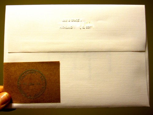
The back of the envelope
Custom “passport-stamp-logo” designed by me and bought at Simon Stamps stamped with watermark/clear ink and embossed with silver powder, both from Paper Source. All envelopes embossed using desk embosser from Horchow with my parents’ return address.
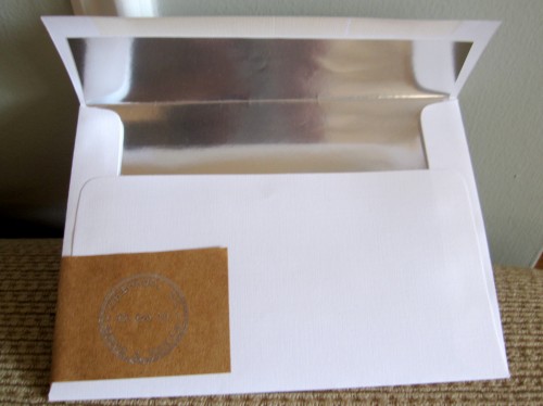
Inside of the envelope
I cut my own template and lined the envelopes with Labels by the Sheet in the most striking shade of SILVER I’ve ever seen on paper.
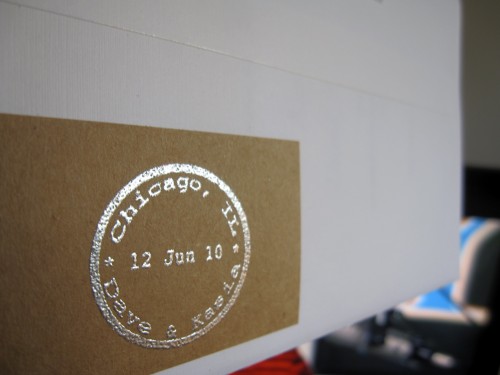
Close up of our embossed stamp (designed to mimic a passport stamp)


Wrap-around labels from the side; aerial view of the “Z” shaped invitation (the third part is the RSVP which is perforated allowing guests to tear it off and send it back to us)
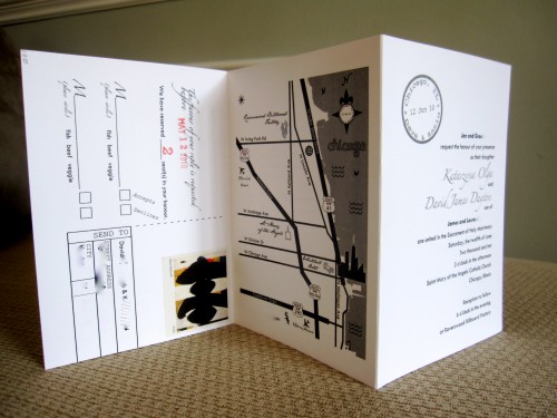
Side 1 of the 15×7 invitation that folds into three 5×7 cards, once scored and once perforated – (From left to right: back-side of the perforated RSVP card, the map on the back-side of the card that guests will be left with, the formal invitation on the front)
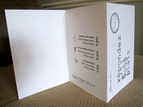
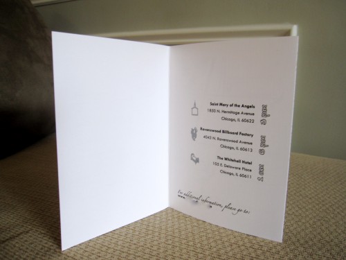
Side 2 of the invitation (From left to right: backside of the formal invitation is left blank; inside of the card lists the three venues for the night, their corresponding start-times, and our website; the front of the RSVP card with instructions at the top to “tear” at the perforated edge


Front of the tear-off RSVP card, in black and silver thermography; Back of the RSVP card
We stamped the # of guests and “RESPOND BY” date in red to match the other subtle hints of red in the invite, without paying an additional fee for using 3 colors instead of 2.
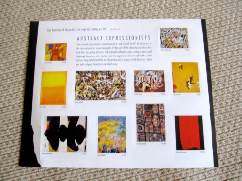
I used the new Abstract Expressionists 44 cent stamps, which added bold color to the RSVP postcards , found at any US Post Office.


Front of (what’s left of) the card
Guests are left with just ONE card consisting of all critical information. Here is the outside of the card: front-formal invitation, back-map. You can’t see it clearly here but our logo, names, and then our venues are all printed in beautiful silver thermography. The rest is in black thermography. (Note the perforated edge on the left where the RSVP postcard was torn off)
Inside of (what’s left of) the card
Listing our venue contact information and their corresponding start-times for easy-to-read information. Our website is listed at the bottom for additional information.
I know they are simple, but I pleased with the end-product. Despite the hundreds of hours I spent trying to gather all my ideas and make one cohesive invitation, its been enjoyable and I learned more about graphic design and printing than any training I’ve been to!
Did you design your own invites? What has your favorite DIY project been so far?