

-

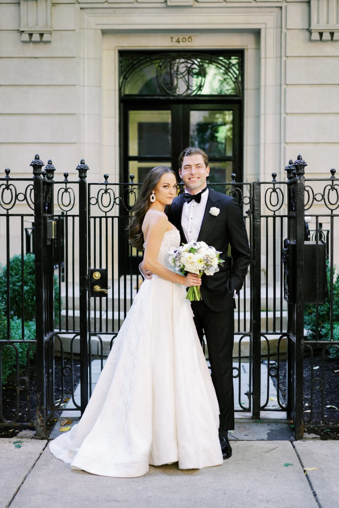
Top 5 Wedding Themes of 2025
-
5 Invitation Trends from the 2013 National Stationery Show
-
Featured Vendor: Hello! Lucky
-
National Stationery Show II: Construction
-
National Stationery Show Part I:Design
-
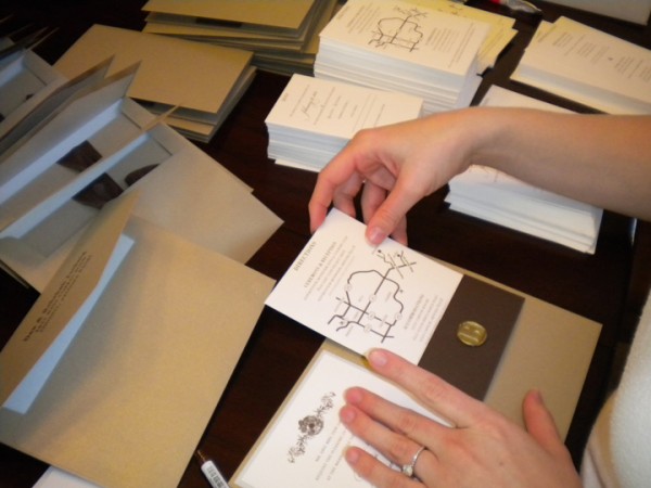
How Our Invitations Came Together
-
The Invitations: Part 2
-
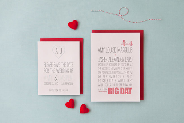
Invitation Preview
-
The Invitations: Part 1
-
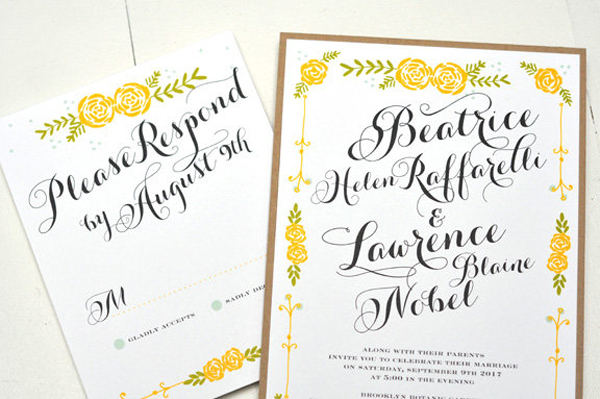
Our ‘Heartland’ Invites!
-
DIY “Z” Fold Invitations
-
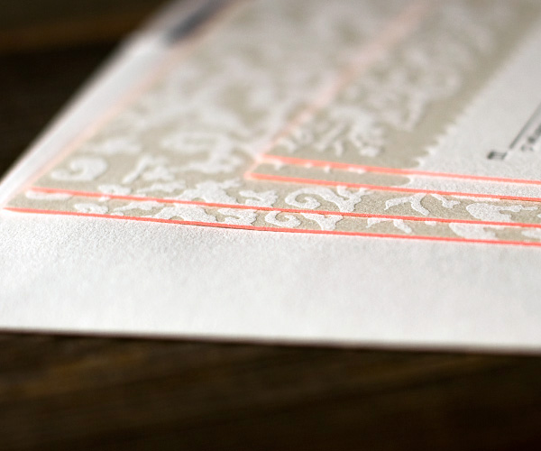
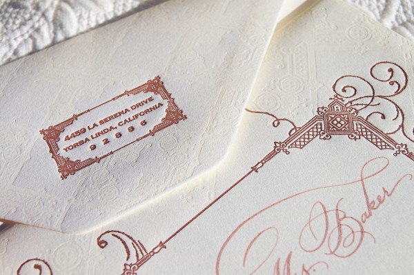
Letterpress Invitations! (squeal!)