

-
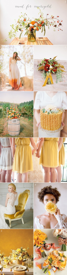
Current Crush: Mad for Marigold
-
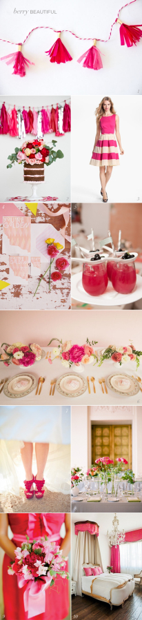
Current Crush: Berry Beautiful
-
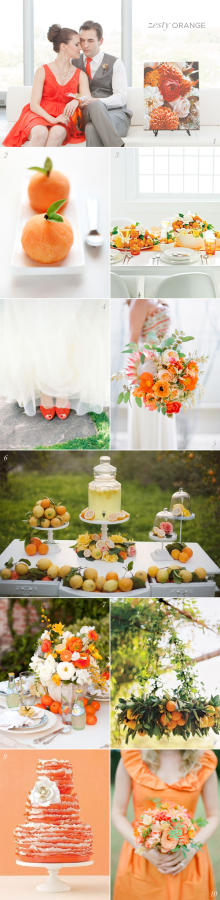
Current Crush: Zesty Orange
-

Current Crush: Bold Black
-

Current Crush: Glittering Gold
-

Current Crush: Emerald Green
-
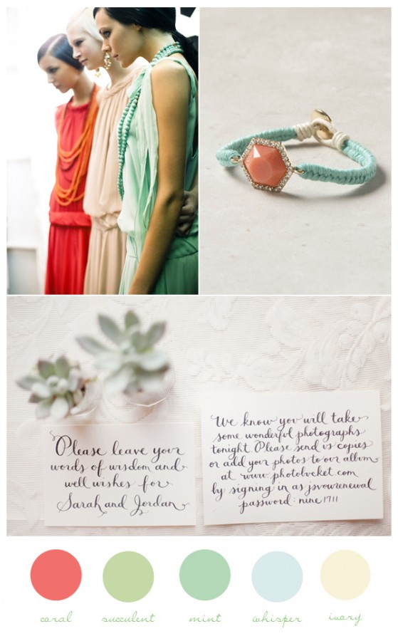
Coral & Mint
-
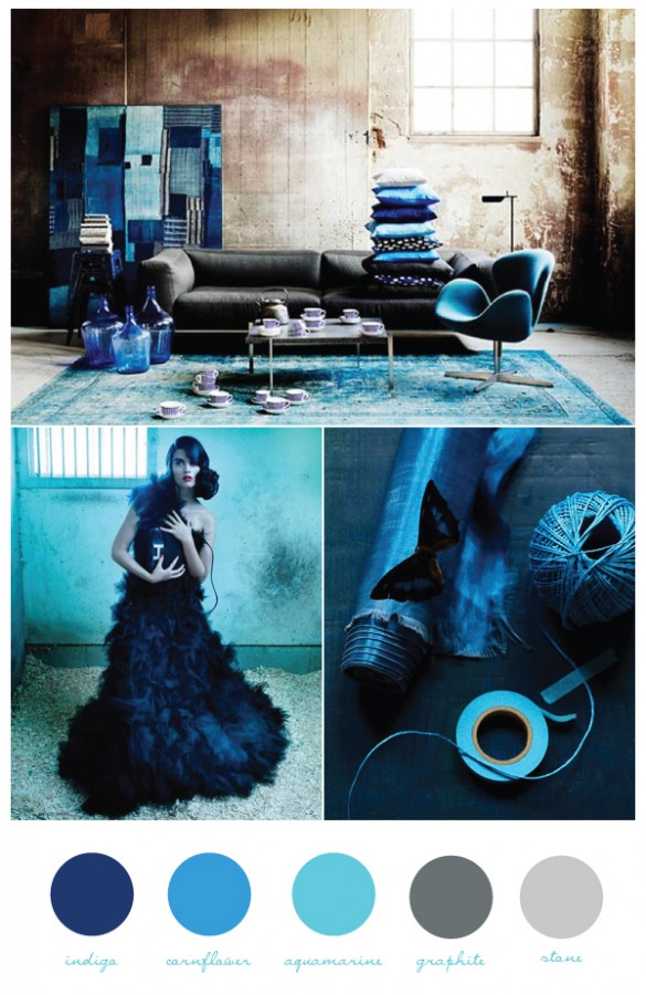
Indigo Blues
-
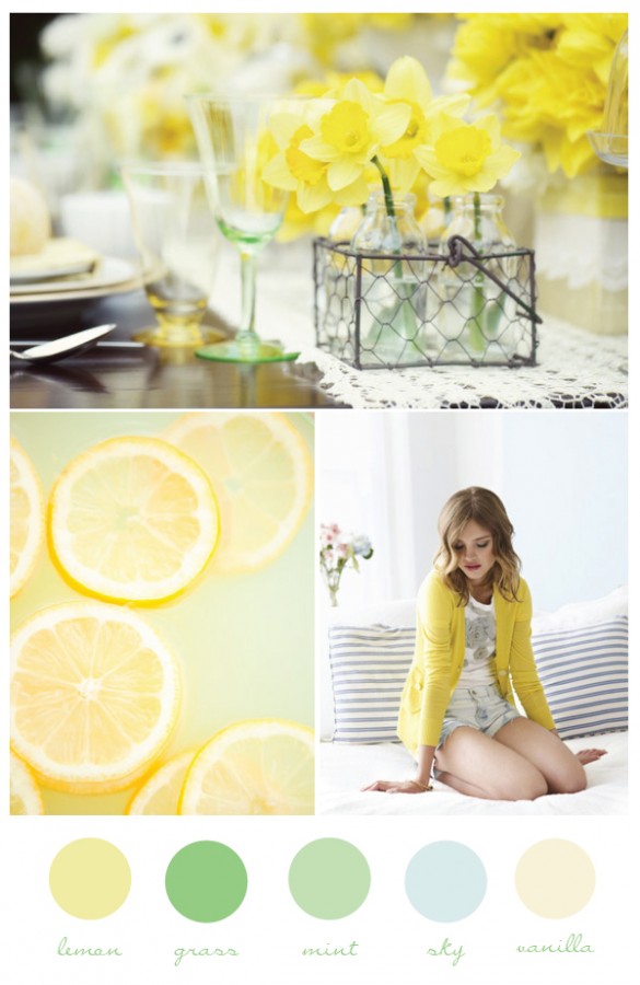
Refreshingly Sweet Lemonade and Mint
-
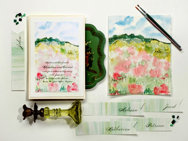
Things I Love: Watercolors
-

Sherbet Florals
-
An Earthy Aqua Color Palette