
-
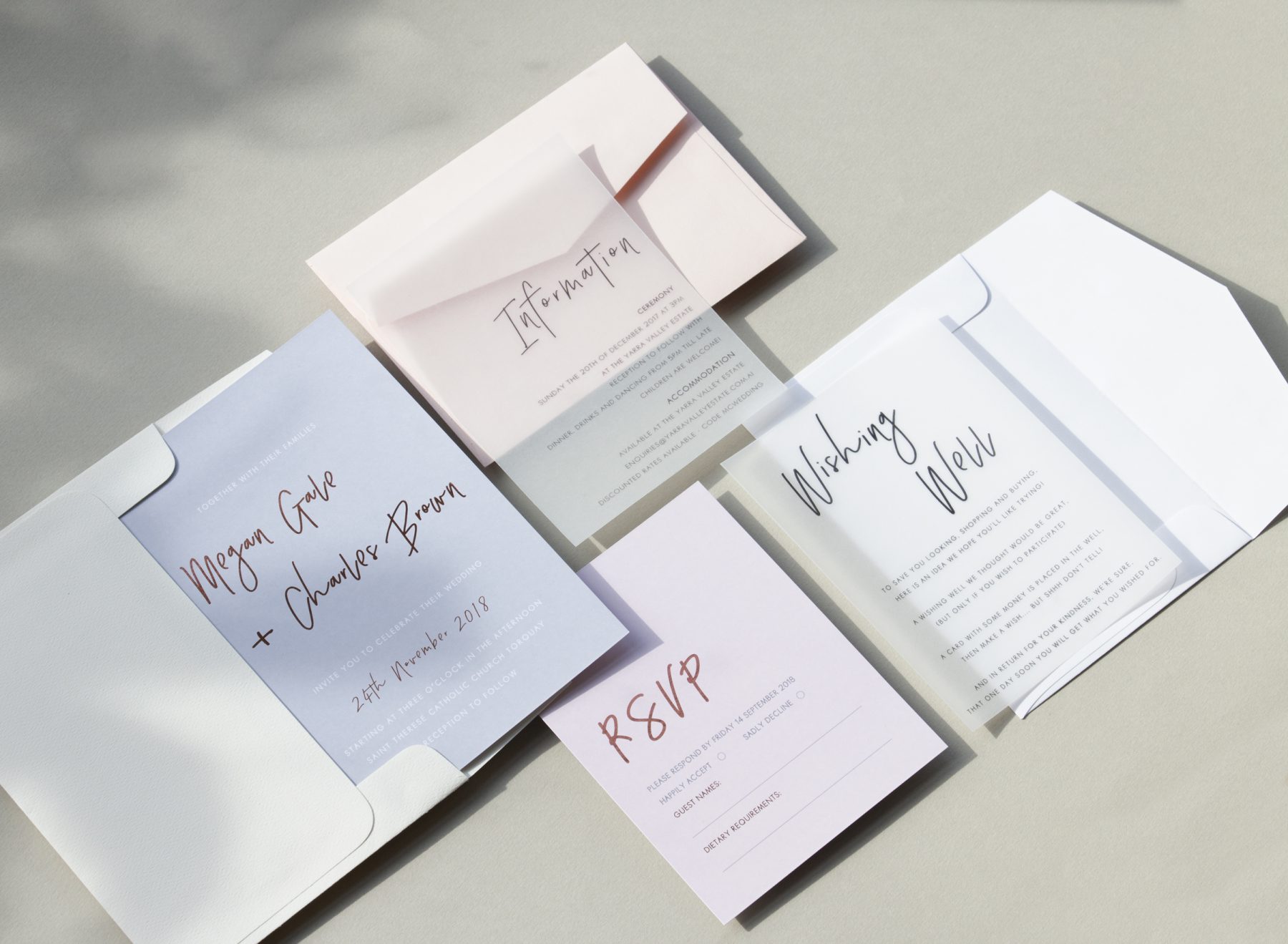
Wedding Invitations from Paperlust
-
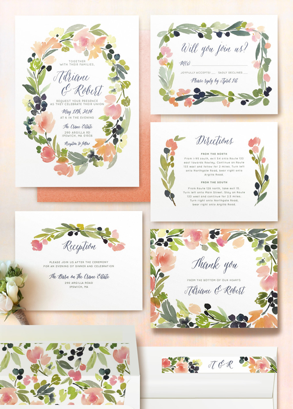
Customizable Save the Dates from Minted
-
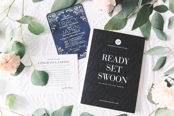
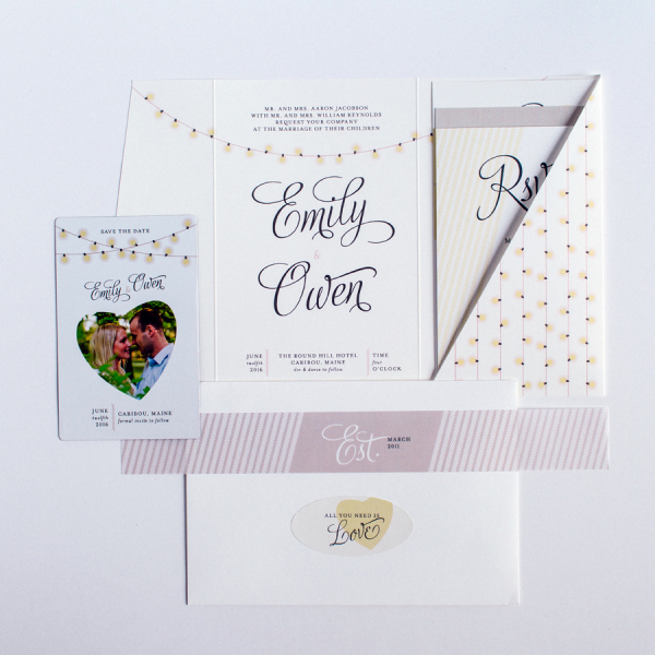
Gorgeous Invitations from Wedding Paper Divas
-
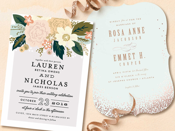
Our Favorite Save the Dates and Invitations from Minted
-
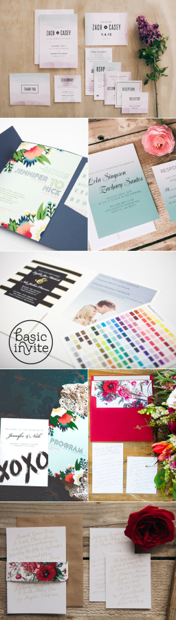
Basic Invite
-
10 Favorite Wedding Invitation Shops On Etsy
-
Style Your Wedding with Minted + Giveaway Alert!
-
MagnetStreet Weddings
-
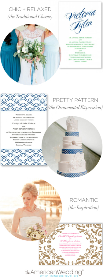
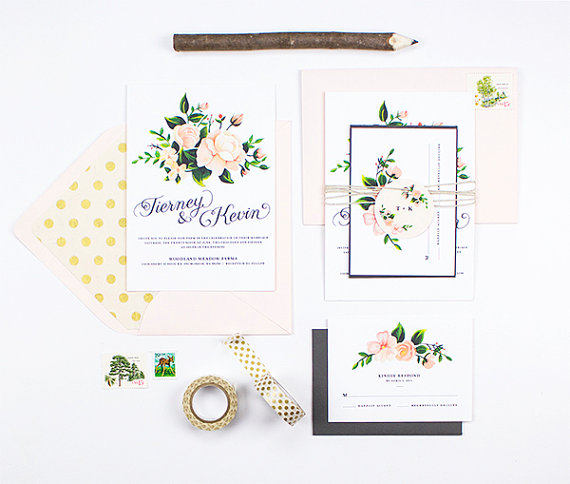
Letterpress Invitations from The American Wedding
-
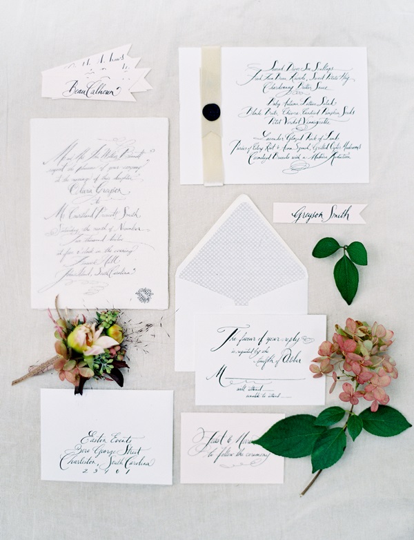
10 Calligraphy Wedding Ideas
-

Crafty Pie Press Giveaway
-

Wedding Invitations from Tweedle Press + Giveaway!